

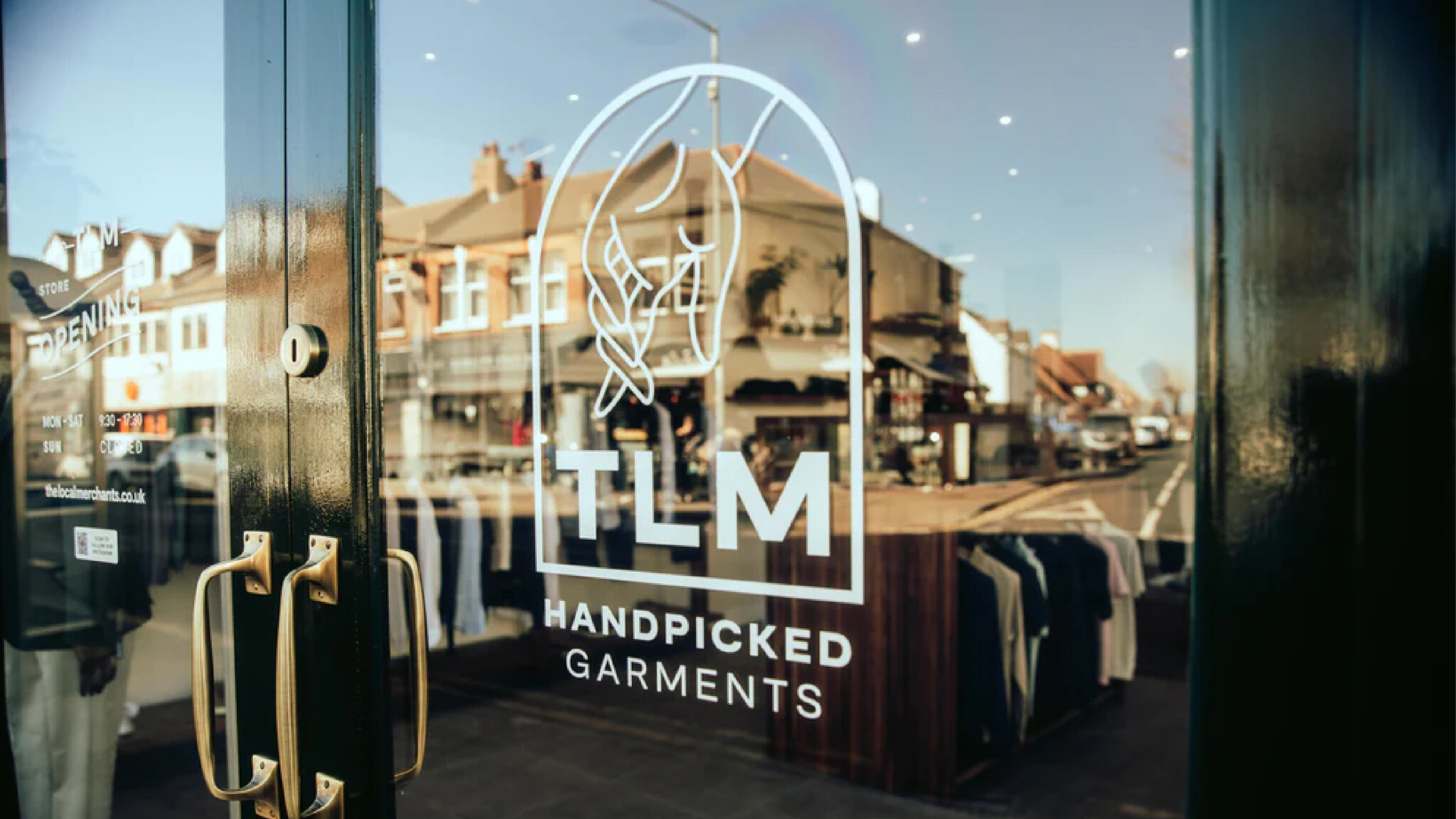
The Local Merchants
A modern take on classical menswear
Brand Identity & Website
The Local Merchants approached us to create a brand identity for their modern-day classical menswear store. With an offering of high-quality, hand-picked garments from across the world, Sam & Ed were keen to let the clothing do a lot of the talking.
With the identity now in place, TLM has already introduced brands never before seen on English shores, and been featured in magazines such as GQ and Vogue.

Moodboard. By Abbie King.

Palette. Refined from the original moodboarding.

Typography. A classic & modern type pairing.


Website. Shopify store design.


Photography featuring co-branded Informal(e) Suit. By Hannah Miles.


Furniture. Additional marks.
Selected Works

The West End • Finally AgencyLocation Branding
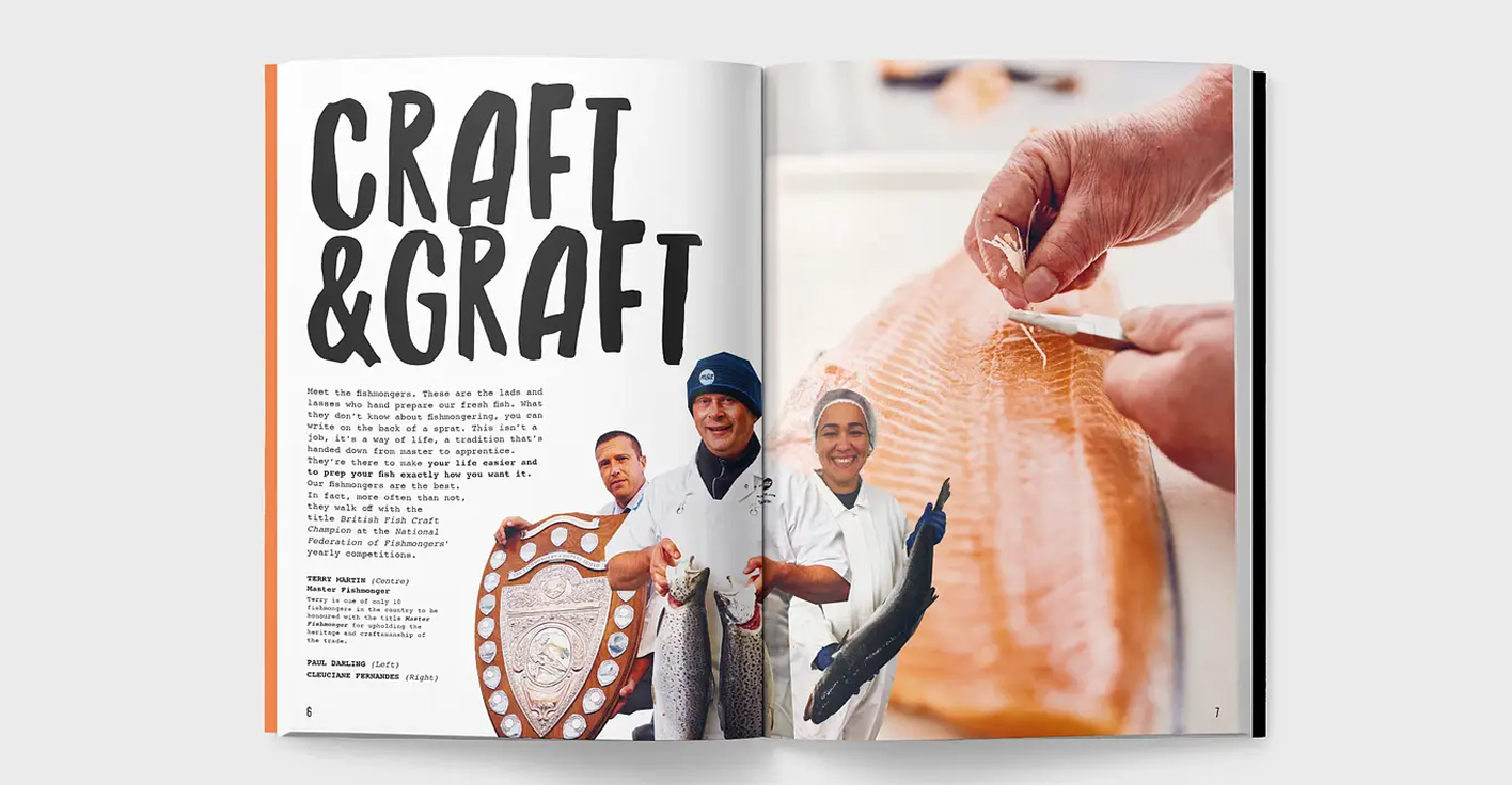
M&J Seafood • AirfieldSeafood Guide
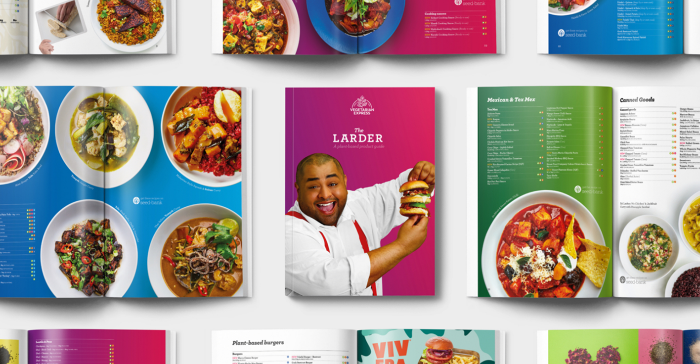
Vegetarian Express • AirfieldPlant-based Foodies
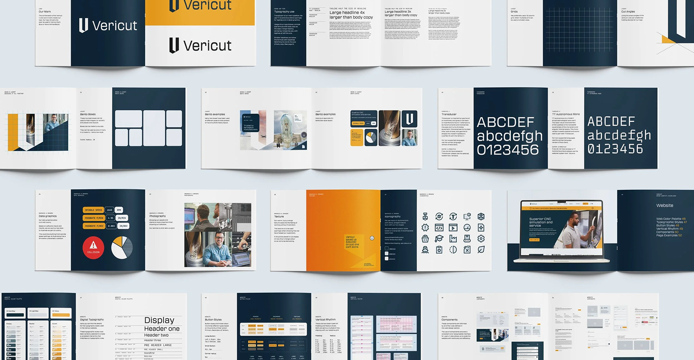
Vericut • Finally AgencyBrand Identity

Vegetarian ExpressBritish Grains
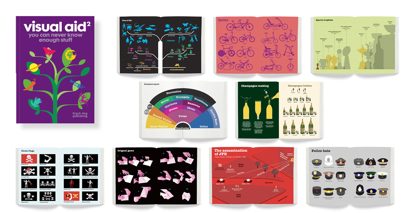
Draught AssociatesViusal Aid 2
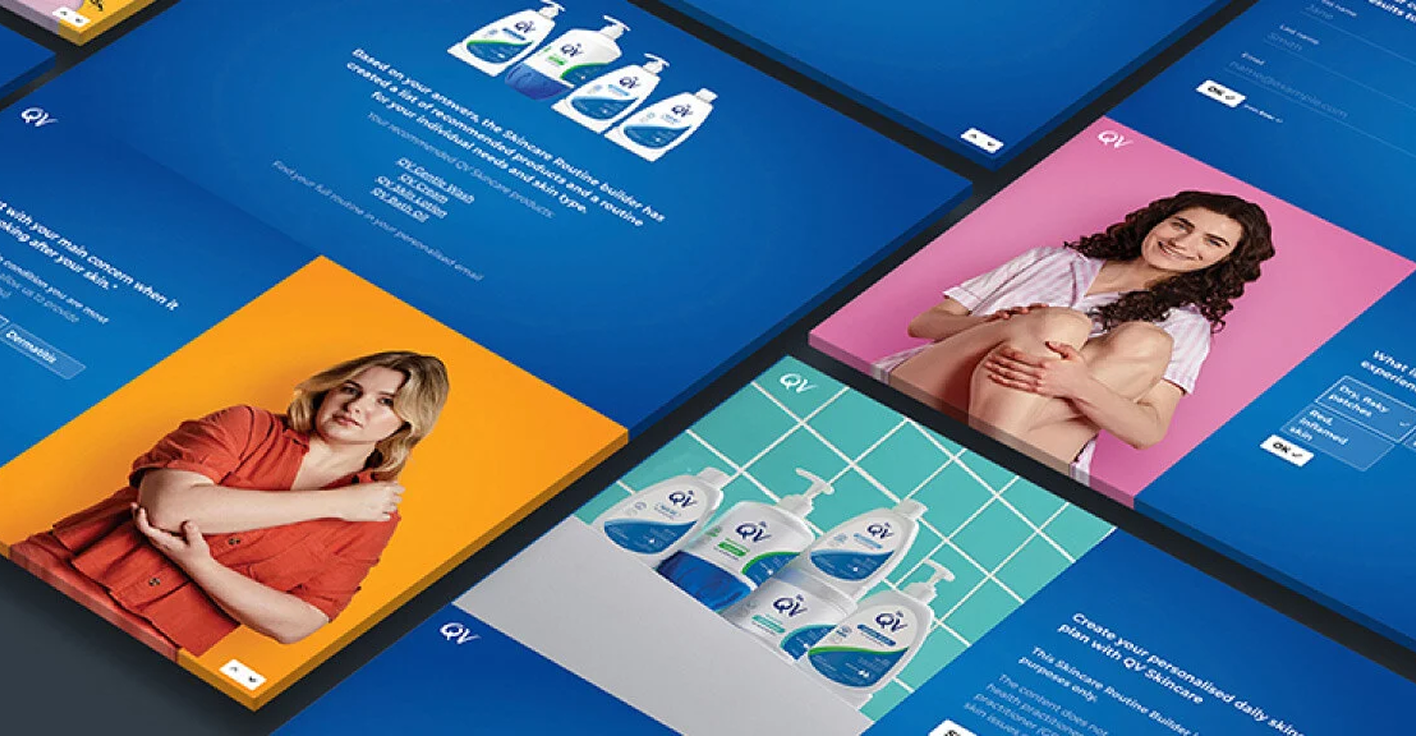
QV • Finally AgencyRoutine Builder Emails
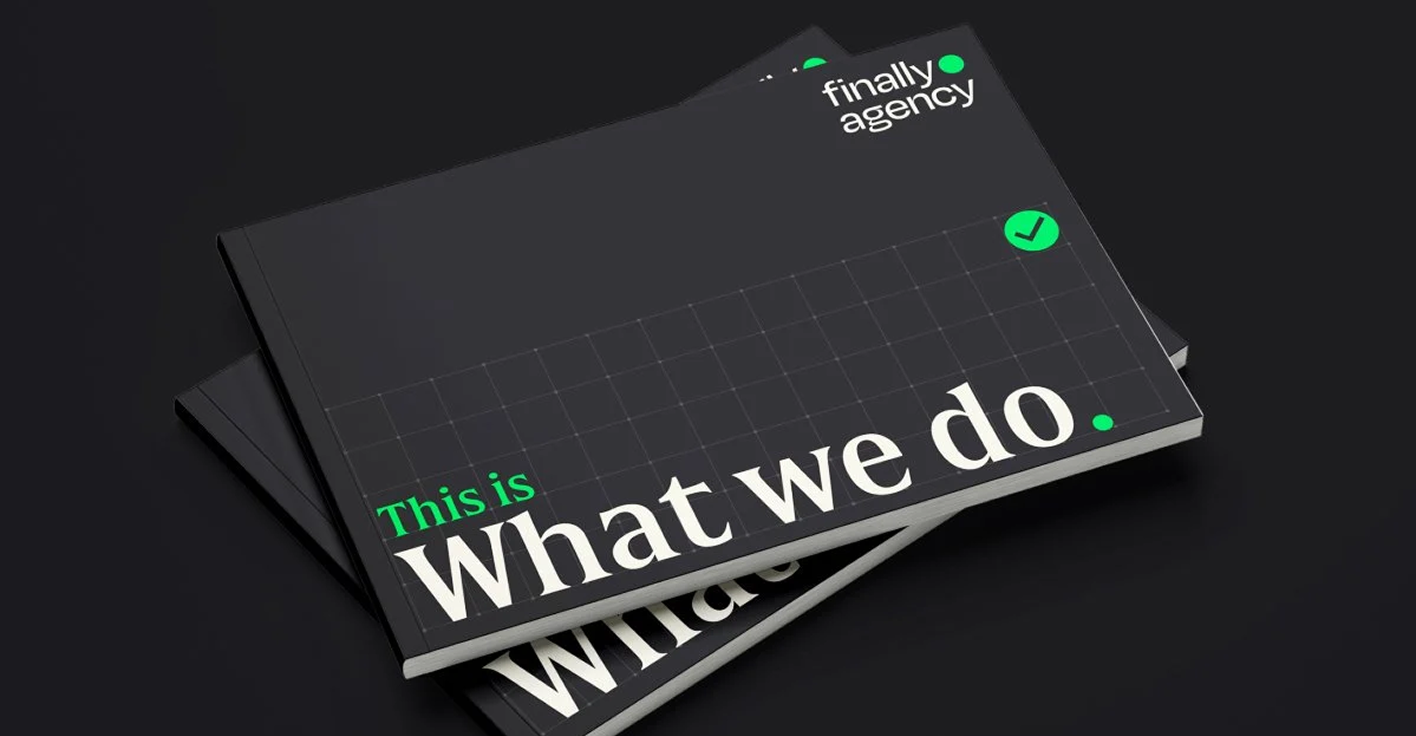
Finally AgencyBrand Identity

Vegetarian ExpressGluten Free

Personal#SafariHolidays

Megger • Finally AgencySpotting the Invisible

QV • Finally AgencySkincare Socials

Individual • Hayward DesignSpitfire Christmas

PersonalWorld Cup 2014
Liam Palmer
Slanghouse
liam@slanghouse.co.uk
+44 (0)77 2060 5133
Liam Palmer
Slanghouse
liam@slanghouse.co.uk
+44 (0)77 2060 5133