
The West End
Rebranding Canterbury’s West End
Brand Identity • Location Branding
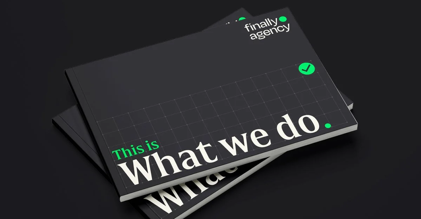
Work completed at Finally Agency
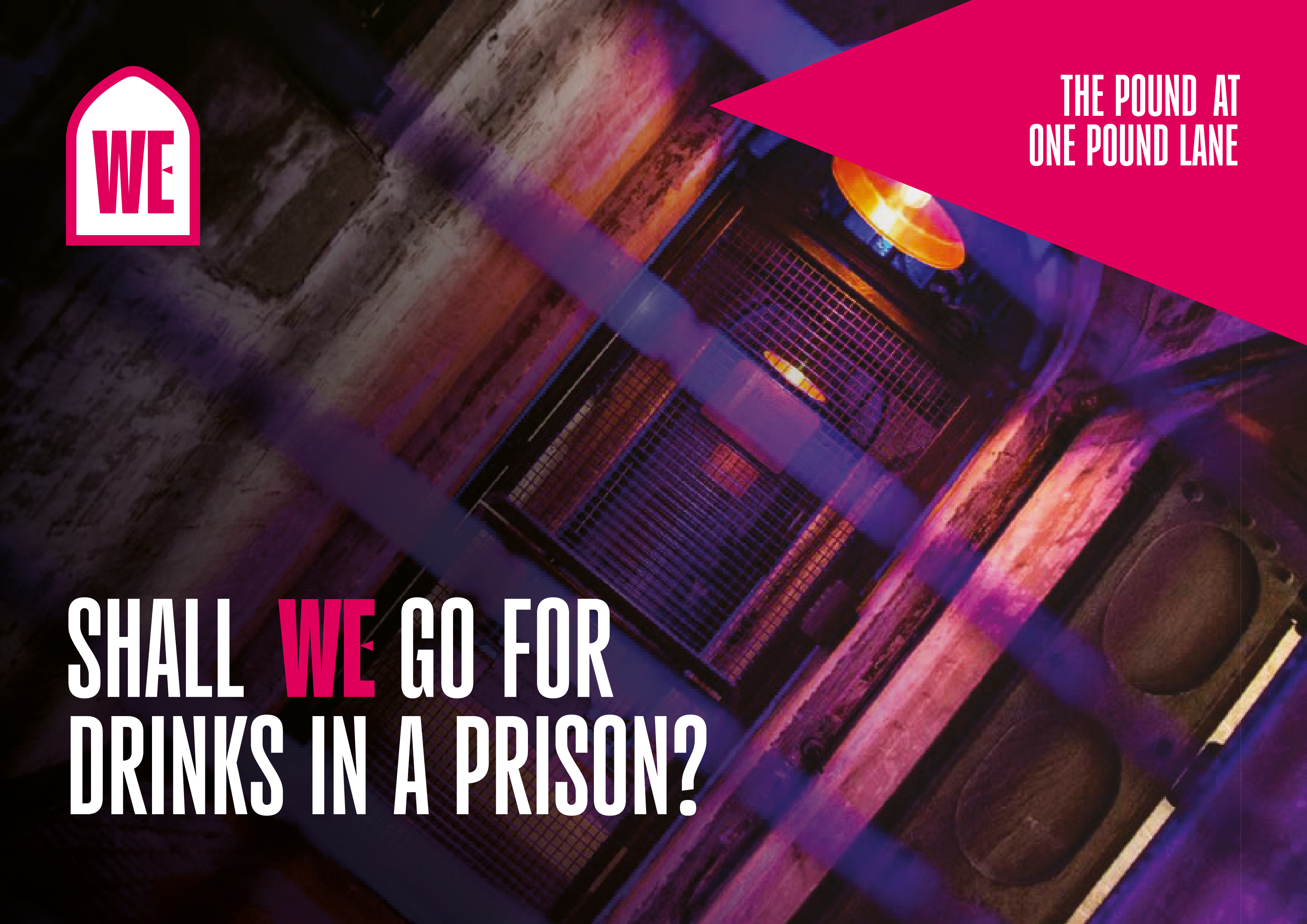
Canterbury’s West End has an amazing mix of history, stunning parks, and a buzzing nightlife, but it lacked a cohesive identity that tied it all together. Working with the Canterbury BID, we created a flexible destination brand built entirely from the area’s unique DNA.
We pulled the colour palette straight from the streets - mixing the deep, fresh greens of the Westgate Gardens with a punchy, vibrant pink that captures the energy of the local bars and theatres. The brand's signature shapes were inspired by the iconic arches, windows, and doors of the historic Westgate Towers and surrounding buildings. Using a 6° dynamic tilt to match the angles of the 'W" help to give a modern, forward-moving edge. Combined with a communal 'WE' logo shortcut and relatable, experience-driven copy, the brand celebrates everything people love to do here. It’s clean, eye-catching, and gives the West End a distinct voice that feels both historic and incredibly alive.

The West End. A mix of all the brand elements.


Inspired by architecture. Brand shapes were inspired by gateways, doors and windows in the area.

Colours. Colours were inspired by local landmarks, gardens and nightlife.


Brand Examples. Typography and image lock ups help to pull all the elements together.


Rotation Rules. Elements always point in one of three directions. Straight OR +/- 6°.


Merch and Posters. Examples of merch including the obligatory tote bag.

Signage. Signage and wayfinding mock ups.
Selected Works


Liam Palmer
Slanghouse
liam@slanghouse.co.uk
+44 (0)77 2060 5133
Liam Palmer
Slanghouse
liam@slanghouse.co.uk
+44 (0)77 2060 5133